 I was so busy playing with Photoshop last night that I completely forgot about watching the meteor shower. In fact, I didn’t even remember that I’d forgotten until just a few minutes ago.
I tend to focus on things that I’m interested in to the exclusion of everything else. Years ago a house burned down a block away from us, and I didn’t even notice the sirens or smell a thing.
I wonder what else I miss while I’m in creative mode—which is pretty much most of the time.
 David came to visit for a few hours this afternoon and he was telling me how much he’s been learning in the glass studio. Lately he’s been cutting metal, building kilns and suggesting changes to the software they use to control the heat.
Something that’s made a big impression on him is just how much the little things count. For example, when you’re cutting metal you lose about 1/16” with every cut you make, so that has to be factored into the figures when you’re ordering supplies.
This reminded me of that old saying: measure twice, cut once. I'm sure we’ve all learned this the hard way at some point or another.
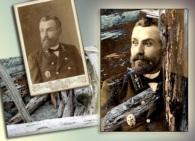 Using an old photo in Photoshop can be challenging. Luckily there’s plenty you can do to revive them. Jeanne sent me a scan of this Russian officer which I really liked, so I decided to combine it with another one of her images—a photo of some logs she’d taken earlier this year at Artfest—and combine both into an ATC.
1. First, I cropped the Russian officer to 2.5” x 3.5” and used Adjustment>Levels, Adjustment>Contrast and Adjustment>Saturation to give him more definition.
2. Then I opened the photo of Jeanne’s logs and applied Levels, Contrast and Saturation again.
3. Using the Move tool, I transferred the Russian Officer over to this document and chose Lighten from the layers palette so the logs would show through him.
4. I shifted Jeanne’s guy around until the logs provided a textured frame, and then cropped to 2.5” x 3.5” without merging the images.
5. To make the logs stand out more, I applied Filters>Watercolor.
6. The Russian officer looked a little pixilated to me, so on this layer I used Filters>Palette Knife to soften him up. Note: you will have to play with the filter sliders to get the effect you want.
7. I saved this two-layered ATC, then resaved it merging the layers, and I was done.
The morale of this particular ATC is that if you like an image, don’t give up on it if it doesn’t do what you want it to do straight off. Play with the different options under Image>Adjustments and don’t be afraid to experiment with Filters and Layer effects.
 This is the 100th digital ATC I’ve designed since January 1st and I’ve celebrated by Photoshop-ing this image of Aunt Connie against a scene from Andrea’s cottage.
Does she look like an “Aunt Connie” to you? She doesn’t to me. Nevertheless, that’s her moniker on the back of this photo. (Thanks for the image, Wendy!) In order to get the effect I wanted, I used ten different layers in Photoshop and had a ball.
Last night I looked back at all the digital ATCs I’ve done this year and about ten per cent of them I wouldn’t do again…particularly the one of Emma that kicked this whole project off. Before then, I’d done a slew of others too. I probably have another hundred tucked away in various files, but I don’t think they’re as good. Sometime—when I have the time—I might troll through my Photoshop files and tally them up. But personally, I’d rather be creating new stuff than trying to resurrect my earlier efforts.
Yesterday when Godelieve left a comment on my blog, she wondered how these ATCs would look in a book. I think that’s a great idea Godelieve. Thanks for the suggestion.
 For three days John and I have had no Internet access because of several brownouts on Saturday night. Horrors! Am I the only person who worries they might miss the email that could change the course of their entire life (in a good way)? Pathetic, isn’t it?
Sunday was my niece Claire’s 21st birthday party and for the first half hour I had to control myself from going upstairs to Pam’s office to check out my inbox. Fortunately I soon forgot about connecting to the world at large and focused on enjoying the festivities—mainly by doing a lot of eating and yakking, both of which I excel at.But actually, the longer I went without email, the easier it was to handle it. The funny thing is, we could have fixed everything on Saturday because the problem was a build up of static electricity. Unplugging John’s computer (which I’m networked to) seemed to do the trick. Maybe the static inside our own heads was mirrored by what was going on in digital land? Anyway, the point of this post is: if you’re having computer difficulties, unplug everything and then reconnect. This is the second time it’s worked for us—and for different problems.
 I have several books I want to read, but they’re all non-fiction, and I’d much rather spend all day gorging on a big fat novel with Lily on the couch beside me. But that won’t be happening because I have too much to do. Maybe Monday? It’s a holiday here in Canada.
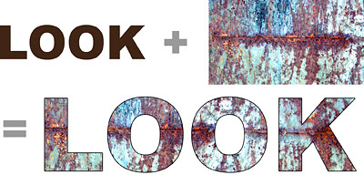 This week I’m going to explain how to turn a photo into type. It’s a fun technique that you can use for scrapbooking pages, a simple card or even as a collage element.
1. Open a new document—5” x 2.”
2. Set the foreground color to black in the Toolbox.
3. Click on the type (T) icon in the Toolbox. Choose a chunky typeface—I used Arial Black here—and a high point size. To go above 72 pt type, you will have to set the number manually in the Options Bar just like you do the typeface. Now position your cursor and enter your word, but don’t rasterize the type.
4. Using the Move Tool, drag the photo you want to use into your new document making sure it becomes the layer above your word. (I used part of a photo I’d taken of rusted metal in my example).
5. Press Control-Alt-G (Mac: Command-Option-G) to create a clipping mask and your photo will instantly turn into type. Use the Move Tool to shift your photo around until the effect pleases you.
6. If you want to outline your word like I did here, double click on the space to the right of your word in the Layers Palette. This brings up the Layer Styles Menu and you click on Stroke. Because a Red outline is Photoshop’s default color, to change it to Black, you will have to double click on the space beside Stroke to bring up yet another menu. Click on the Color rectangle to open the Color Picker and choose Black—or another shade if you like. Sounds complicated, but once you’ve done it a couple of times you’ll get the hang of it.
Note: This effect works with Photoshop versions CS and higher. If you’re using Photoshop 6 or 7, check out Photoshop 911 for the steps you need to take to achieve this effect.
 This is another one of my altered ATCs in the unfinished “Hot Babes” series. Last month I picked up a pile of trading cards for ten cents at a lawn sale. Even though I’ve only managed to find time to alter four of them, it’s a fun project and I’m actually using some of the scrapbook paper, dictionary pages and maps I’ve amassed over the years.
I’ve been wishing I had this babe’s energy because I’ve been under the weather since yesterday. I went to bed before twelve last night, which is something I only do when I absolutely have to.
 Emma got an email to say she’d passed her bar exams today, and we’re so thrilled for her. Now all she has to do now is work like a dog* for the next ten months to finish her articling and then she’ll be a full-fledged lawyer. One of the areas that interests her is Intellectual Property—copyright is part of this specialty—so at some point I’ll be able to speak with more authority on this subject (albeit vicariously).
Sometimes I’m tempted to use this blog as an excuse to complain about things that are troubling me. But something usually comes along to distract me—like Emma’s good news or a slice of Longo’s strawberry cream cheese crumb cake. Okay, I’ll admit I’m proactive about the cake thing. It’s a good job I don’t live near Ronna, or I’d be making a pest of myself sampling all of her sweeties.*I’m not sure where the expression “works like a dog” comes from. Aside from patrolling the backyard for skunks and chasing airplanes and rabbits, Lily’s work consists mainly of finding comfortable spots for extended naps and hassling me for snacks. I swear she must have some hobbit in her because second breakfast is obviously her mantra.
I got the bright idea of changing my header tonight. What a nightmare. I deleted stuff by mistake, added others and generally went nuts choosing from fonts and colors. I would like to be able to change each element separately, but Blogger won't let me. Grrrrr. It's time for bed.
 I Photoshoped this black and white picture of my Dad and me to give him when I went to see him today and he loved it. It’s funny to see Dad in a hat, but I remember men wearing them when I was a child.
Customs certainly do change, don’t they? Sometimes it’s hard to believe I was born before TV, cell phones and the Internet. No wonder my brain is fried at times. It’s all too much to take in.
I suggesting going to Swiss Chalet for dinner, which is where we went as a family on Sunday nights for a treat. While we were eating, I told my dad about the time I went there on a date. When the bowls of water with slices of lemon to clean your hands arrived, my date drank it instead. Dad thought this was hilarious, and when the bowls arrived at the end of our meal (some things don’t change), we both burst out laughing.
Dad was up until 2 a.m. last night trying to find the answer to a puzzle, so we worked on it together and still didn’t come up with an answer. The puzzle is: You have 12 identical looking coins, one of which is counterfeit. The counterfeit coin is either heavier or lighter than the rest. The only scale available is a simple balance. Using the scale only three times, find the counterfeit coin.
Dad says not to hesitate calling him at three in the morning if I manage to figure it out. Any ideas?
 It’s been a really busy week, and because I don’t have anything interesting to say, I thought I’d post my latest ATC.
My friend Debbie Smith Doyle took this fab picture of an owl standing guard in a tangle of branches. Debbie says she can’t remember taking it—probably because she takes so many great photos it’s hard for her to keep track.
John and I are looking forward to the finish of Le Tour de France today. It’s been plagued by scandal yet again this year. I’m just hoping that they don’t stop televising it in the future because of this.
During the first week of the Tour, I had a premonition Australian cyclist Cadel Evans would win even though he was thirteenth at the time. Now Evans is second to the leader, Alberto Contador, so it will be fun to see whether or not he wins. My favorite, Vinokourov—from would-you-believe-it, Kazakhstan*—was bounced for doping, but it has been a really exciting three weeks anyway.
Well, I can see I’m starting to get revved up about the Tour again—John and I talk about it almost non-stop—so I’d better bail out now before I go on and on and on about it.
*Maybe Vino will be in Sacha Baron Cohen’s next Borat movie.
 To add a vintage look to your favorite photo, try a Vignette. I used this scan of an old French postcard to show you how.
1. Open your image in Photoshop.
2. Click on the new layer icon in the Layers Palette.
3. Choose the Elliptical Marquee Tool from the Toolbox. Then click and drag an ellipse onto this layer, using your cursor to position it. (If you don’t like the size, deselect and try again).
4. Go to Select and choose Inverse. You can see the “marching ants” on the postcard above.
5. Go to Select again and this time choose Feather. Enter a radius of 25 pixels in the box and then click OK. Note: The higher the number of pixels you enter, the softer the effect will be.
6. Set your Foreground color to white. Then use the Paint Bucket Tool to fill—and that’s all there is to it.
 I’ve always loved garbage and junk. Nothing icky mind you, but stuff you can see using in your art.
This gum package appealed to me because it went from looking sterile and manufactured to a conceptual art piece after the gum had been eaten and it was empty. I wanted to use the package in a collage, but nothing seemed to come together. Since I couldn’t bring myself to throw it out, I decided to scan it and do something digital. Now that I’ve finally answered the call, I feel free to put the package in my recycling bin.
 Once upon a time I used to write book reviews for a magazine. I always enjoyed this—although it was a challenge trying to reduce 200 pages or so to 350 words. But one of the nice things about having a blog is that I can mention a book before I’ve even read it, so I thought I’d mention three I got for my birthday you might like.
Atlas by Gerhard Richter. This is an 800-page survey of Richter’s photographs, collages and sketches. Just looking at a few pages tonight gave me several ideas I’m going to make a note of in my journal. This book won’t appeal to a lot of people, but if you’re a Richter fan and a Photoshop addict like me, you’ll love it.
Foolsgold: Making Something from Nothing and Freeing Your Creative Process by Susan G. Wooldridge. Poemcrazy, the book Wooldridge wrote in the mid 90s, has always been a favorite of mine. Her second book looks as good as the first. It’s about her continuing journey as a poet—she’s doing collage now too—so there is plenty of inspiration here, plus some cool exercises. It’s all text though, and I found myself wishing I could see some of her art.
Kaleidoscope Projects and Ideas to Spark Your Creativity by Suzanne Simanaitis. This is a compilation of inspiring essays and projects by Simanaitis and other artists like Juliana Coles. Marissa brought it to our last club meeting and offered to loan it to me because she could see I was interested. But I decided to ask for it as a birthday present instead. This looks like a great book—lots of visuals—but the type is too small to read comfortably. If I’d been the editor and/or art director on this book, I would have split the information up and given Simanaitis a two-book contract because she deserves it.
 I’m ready to start my next journal, but I was going to do this when I’d finished my book. I spent three days reading through it and making changes I want to incorporate. So much for my July 31st deadline—I’m not finished yet again. However, I’ve decided to shut up about my book until I’m ready to send it to my editors-at-large.
In the meantime, I need the comfort of my journal. My last two had a lot of stamping, but no color mainly because I was too busy to go that route. I think I will use some markers and colored pencils this time though, and I’m going to put this over trimmed ATC inside the front cover. I usually make a policy of avoiding images that aren’t copyright-free, but I doubt Marvel is going to come after me for incorporating one of their characters into this collage.
 I’m really feeling pleased with myself tonight. My mother is going to Britain on Tuesday with my brother Keith and she wanted me to make copies of this family picture to give to her cousins, one of whom is 96 and still living on her own.
I had serious doubts when I saw the original. Actually it wasn’t the original, but a copy someone had made of it. There was obviously water damage down the left-hand side, and all of the faces were badly exposed. But I never say no when it comes to Photoshop. After a couple of hours of hard but absorbing work, I managed to improve on the quality of the copy according to John—and I think so too.
My tiny perfect Nana (Joanna) is the figure on the right. When we were staying with her in Wales back in the 50s, she taught me how to knit, and I liked to watch her take her teeth out every night and put them in a glass!
Judging by the information on the back, this photograph was probably taken sometime in the 1890s. The family was originally from Cornwall (where my grandmother was born) and then they moved to the Lake District.
Nana trained as a nurse and had a career until she married in her mid thirties. She had my mother at the age of forty and being an “older” mother didn’t phase her one bit. Nana went on to live until the age of 91, and her mother (my great-grandmother) lived until 89. No wonder my own mother is still going strong.
 I was looking at my notebook from last year this morning, and I realized that I was doing a lot more socializing then than I am now. This week I’ve limited myself to one night out, and I’ll admit it’s driving me a little crazy. But I really don’t have a choice. If I want to finish my book and website in a timely manner, that’s what I have to do.
Years ago I remember reading an interview with the novelist Barbara Taylor Bradford. When asked how she managed to write novels when she was working full time, she replied: “Well, I don’t go to parties.”
But it’s hard having to make decisions like not seeing your friends or doing other things you know you’d enjoy. When you’ve set yourself certain goals though, there’s really no way around it, but to choose to focus on them.Tonight we’re having dinner with my parents, and Robin, Wendy and Wakelin. Here’s a digital ATC I did of my nephew Wakelin that I’m going to give to him later.
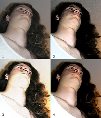 Filters are a fun way to change an image almost instantaneously. Some are very dramatic, but I prefer a more subtle approach—particularly for portraits.
There are three things you should know about Filters before you begin to play with them:
First, go to the Layers palette and duplicate the image you want to alter. Then use this layer to work with. That way your original remains intact if you decide you don’t like the result.
Second, resolution is important. The lower the resolution, the more exaggerated the effect—not usually my preference—so I work at 300 ppi, and then reduce the image to 72 ppi if I plan to post it on the web.
Third, take time to play with the controls most filters offer you. Just using one filter can produce a wide range of different effects.
Now I’ll explain what how I experimented with this photo of David:
(1) I cropped the original to make it more graphic. You can see that David looks a little flat, so I went to Image>Adjustments>Auto Levels, and Hue/Saturation to give him more contrast and stronger color. I used this as the starting point for my three versions.
(2) To turn David into a rock star look, I headed (digitally speaking) to Filter>Artistic>Fresco and chose the least extreme effects: 1-1-1. It doesn’t get much easier than that.
(3) This version of David was achieved by choosing Filter>Stylize>Find Edges. You don’t have to make any decisions here—just click and you get what looks like a sketch. But because this looked too washed out to me, I went to the Layers palette and chose Overlay. This allowed the color on the original layer to show through.
(4) This is my favorite because it looks the most painterly. I went to Filter>Artistic>Palette Knife and chose 13-3-4 to get the effect I wanted. But it’s not a formula. Your own photos will likely require different numerical values from mine.
See you next week!
 Over the years I’ve been addicted to a number of TV shows including Star Trek, Mork and Mindy, Soap, Dr. Who, CSI Miami and The Pretender. In fact, I loved The Pretender so much that even though I’d thrown my back out one Saturday night and couldn’t get up from the carpet, I insisted on watching the show straight through. Only then would I let John call the ambulance. Nuts, huh?
Apparently there are over 1,600 fan fiction stories about The Pretender posted on the Internet right now — mainly to do with Jared and Miss Parker. No surprise there, but I was amazed that people would bother to do this. Because I’m a writer myself, I know how much work goes into any kind of story, whether it’s written for love, money, or both.
Apparently Fan Fiction got started in the 70s with Star Trek aficionados anxious to entertain themselves between episodes. Naturally it’s snowballed since then because of the Internet, and that burning desire people have to share their work with others.
If you’re into Harry Potter and tired of waiting for the latest book, check out this recent article in the Telegraph for links to fan fiction sites. (Supposedly there are over 200,000 Harry Potter stories you can read).
Anne Rice won’t let fans use her characters, but J.K. Rowling doesn’t seem to have a problem with this. And why should she? I think she’s worth well over a billion by now, and I’m sure she has better things to do than harass the people she knows have helped to get her to where she is today.

 I was so busy playing with Photoshop last night that I completely forgot about watching the meteor shower. In fact, I didn’t even remember that I’d forgotten until just a few minutes ago.


