 If you’re a type junkie like me, you welcome any Photoshop effect that enhances it – and as you can see from the Back to School samples shown above, adding a drop shadow gives the type more dimension.
Here’s how I did it:
(1) Open a new document 3” x 2” in size.
(2) Click on your Foreground Color in the Toolbox to bring up the Color Picker and choose yellow. (I was aiming for the school bus look).
(3) Go back to the Toolbox and click on the Paint Bucket to fill your white space with yellow.
(4) Now return to the Foreground Color in the Toolbox and change the color to black.
(5) Then it’s back to the Toolbox again, but this time you’ll click on the Type tool.
(6) In the Options bar above, choose Helvetica>Bold>48 pt type. (If you don’t have Helvetica, another bold sans serif type will do just as well).
(7) Position your cursor and type Back to School. Use the Move Tool to shift your finished type if you need to.
(8) Go to the Layers Palette and you will see that Back to School appears on its own layer. Double click in the space right beside it to bring up the Layer Style dialogue box.
(9) Under Blending Options, choose Drop Shadow. (10) Click beside Drop Shadow to bring up more options, and using the slider, lower the Opacity to 40 per cent. Then click OK and you’re done!
 A couple of years ago Carmi gave me a book called Joseph Cornell's Theater of the Mind: Selected Diaries, Letters, and Files. I have several other books on him, but this is the only one that focuses on his writing and I love it.
My favorite line of Cornell’s is: “…day/and I gathered fragments of blue dense.” For a while now I’ve been trying to think of a way to express these words visually, and I think this ATC is the closest I can come to it. Of course I just had to include the Medici princess (Bia) that Cornell features in one of his well-known assemblages.
 Do you remember Hackers? It’s the 1995 movie starring Angelina Jolie (and her lips were just as plump then as they are now). Anyway, there’s a scene where the hackers are trying to break into Fisher Stevens labyrinth of files—graphically represented as mile after mile of skyscrapers.
Tonight when I was doing a back up that’s exactly what my hard drive reminded me of. I have so many files it’s insane. Do I have the strength for a total cleanup of the megacity? Somehow I doubt it. Where is Batman when I need him?Fortunately I’m off tomorrow to spend three days in Orillia with Bruce and Diane, so I can postpone any action for now. It will be good to get away from everything digital. David gave me a nifty book of old anatomy illustrations, so I’m going to take that to look at, along with some art books and my journal.
 Saturday is my least favorite day of the week. I think this might be because I was stood up for a high school prom on a Saturday. I still remember spending that night reading Gone With The Wind in my nightgown and a beehive that had been carefully concocted at the hairdresser’s earlier. (My friends were all out partying of course).
Fortunately teenagers don’t worry about having a date for the prom now. They just go anyway, which I think is much healthier.
John took me to see Stardust this afternoon and we both enjoyed it. It’s a charming movie and I’m surprised that it only got a 73 per cent positive rating from the critics on Rotten Tomatoes. Then again, Existenz—a movie that reminds me of a bad case of stomach flu—got 71 per cent, so all things considered, you’re probably best to go with your gut…or is that an oxymoron?
When we got home, David called and I spent an hour chatting to him about art, life and more art. I usually play in Photoshop when I’m talking on the phone, but I was so engrossed in our conversation that I completely forgot about it.
Tonight I’ve been enjoying ATC Quarterly. Each issue is such a gem, and Ronna does a great job of putting it all together. I think what I love about ATC-Q is the incredible variety…different ages, different approaches, men and women, and lots of fab art. It’s always so fresh and inspiring. The cover (shown above) features a journaling ATC by Cindy Couling, and inside there’s an article on her. I keep thinking I’d like to do this myself. Now I’ve promised myself that I actually will.
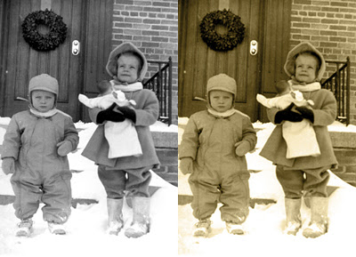 It’s easy to add a sepia tint if you want to give a black and white photo a vintage look. There’s more than one way to do it in Photoshop, so I’ll share one of them with you today.
1. Open your photo—I chose one of my brother Robin and me—and then go to Image>Adjustments>Levels, and Brightness and Contrast to perk up your image.
2. Next, click on the New Layer Icon at the bottom of the Layers Palette.
3. Now go to the Toolbox and click on your foreground color. This brings up the Color Picker dialogue box. Choose Color Libraries and then Pantone Solid Coated (usually the default). Type 133 and this will bring up a brown swatch. Click OK.
4. Then click on the Paint Bucket in the Toolbox to fill the new layer with color.
5. Go back to the Layers Palette and choose Color from the dropdown menu to make the layer translucent.
6. Adjust the opacity in the Layers Palette to get the effect you’re after. I lowered mine to 65 per cent here.
Note: You don’t have to go with brown of course. If you want to use a different color, you can make that choice in Step 3. Instead of entering 133, click on another color swatch.
 The problem with goal setting is that it’s seductive. You get so caught up in the possibilities that you set the practicalities aside.
I’ve been struggling with this since I started my book. Because of my freelance work, I’m geared to deadlines so I don’t usually procrastinate—and I haven’t been doing this with my book either. But what happens when you put in the time and yet you don’t make the progress you expected?My friend, creativity coach Beth Barany, suggested a couple of weeks ago that I just forget about having a deadline. I liked the idea of taking the pressure off, but I was skeptical. However, since I know from experience Beth has excellent instincts, I decided to give it a try. And do you what? I’ve got more done in the last couple of weeks than I have for ages. So thanks for the tip, Beth. (You rock!)
 Jeanne Schedler—my good pal and Photoshop buddy—has come up with her own version of a round robin: the digital volley. On July 19th, she lobbed the first volley via email (upper left); I responded by altering it and sending it back. We had five volleys each ending with me (picture lower right). Not only was the interaction a lot of fun, but also I learned something about myself: i.e. I don’t like tampering with anyone else’s art even when it’s done in Photoshop. It took me until Volley 10 to feel brave enough to transform Jeanne’s work. She, on the other hand, is much more adventurous than I am. But what else would you expect from someone who has walked on ice flows in the Antarctic?
 Normally when I’m working on a digital collage, I just cruise through my files choosing images that appeal to me, and then I see what happens when I put them together. I try not to over think this process, but occasionally I’ll work on a collage off and on for weeks.
For my slide project series (this is the second), I decided once again to concentrate on using collage elements from Christina’s digiWERX line …specifically a snippet of brocade scrapbooking paper, a button, an image from her daguerreotype sheet, the Polaroid slide mount of course and some writing from a ledger page. I noticed an entry for “Eureka Flour” and decided to call my girl Eureka Flo.I prefer to give the unknown people I transform a name. I don’t know whether this one really suits her, but I like the name enough to consider writing a story about her. Euereka Flo doesn’t look too happy in my opinion, but maybe she was just concentrating on keeping still for the photographer.
 I think my fascination with 19th century photographs stems from my relationship with my grandmother who loved everything Victorian and was always so good to me. I remember dropping a bottle of milk on the floor, and Nana saying: “Don’t worry Sue—it will be good for the wood.”
I used to love going to her apartment to stay overnight because she would make me chocolate cake and sew clothes for my Miss Canada doll. Nana also let me read her True Detective magazines, which she kept hidden under her bed. I loved those mags because they contained the kind of lurid details I just couldn’t get enough of.
When I was looking for something else today, I came across this tintype of my great-grandmother Wakelin—Nana’s mother—and one of her children. I’m not sure which one it is since she had thirteen of them, but I know it’s not my grandmother.Everyone in the Wakelin family had beautiful blue eyes and tight eyelids that made them look like Malamutes or hawks. I don’t mind having brown eyes, but I’ve always envied those eyelids. Oh well, maybe in my next lifetime.
 Even though Christina Lazar Schuler lives at least 2,700 miles from me, I still feel like I’m getting together with her when I visit her website and download some digiWERX treats to experiment with. They don’t cost much because you do your own printing. Or you can do what I do: import them into Photoshop and play.
I particularly like Christina’s ledger pages and Polaroid slide mounts that I used to frame this young miss in the amazing hat from one of her Carte de Visite collage sheets. Do I feel another series coming on? You know I do!
 Over the last year and a half, I’ve bought quite a few royalty free images from istock to alter for use in my book and various freelance projects. Istock prices are reasonable, and if you’re a member you also have access to the free image of the week and the dollar bin, which has lots of cool images to download.
I liked this cute istock image of two sisters walking down a road because it reminds me of the close relationship I have with my own sister Pam. Cropping and changing the color allowed me to zero in on the girls and to give the original more emphasis. Plus it’s easy to do.
1. I opened the istock image in Photoshop and then created a new file. (Always leave your original image intact in case you want to work with it again. I learned this the hard way!)
2. Next, I experimented with the Crop tool to give the photo more graphic interest.
3. After cropping, I right clicked on the Background layer in the Layers Palette and chose Duplicate Layer. Then I did this again, so I now had three layers with the same image: Background, Background Copy 2 and Background Copy 3. (Again, it’s always best to work with duplicate layers in case you want to revert to the image you started with).
4. For Background Copy 2—the middle layer—I went to Image>Adjustments>Invert to reverse the colors.
5. For Background Copy 3—the top layer—I chose Color from the drop down menu in the Layers Palette. As soon as I did this the colors on the middle layer jumped out (well, not literally) to make the photo more dramatic.Even though I’ve done a few gift albums in my time, I’m not really a scrapper. However, I think I’ll try this technique on the next album I do. It might work for a card too.
 Andrea gave me a great book for my birthday called Women, Art, and Society by Whitney Chadwick. If you’re intrigued by the role of women in art history like I am, you’ll love this book. It’s text-heavy but fascinating.For example, did you know that women artists had more freedom in the medieval period than they did in the Renaissance? If you were painting in Italy during the 16th century, any commissions you made went straight to your father or husband. Imagine being the court painter to Phillip II of Spain like Sofonisba Anguissola was, and yet you’re not allowed to have your own money or cash your own cheques. I’m just grateful I’m living in the 21st century myself.
 I’m finally beginning to understand Adobe GoLive. Sort of. I keep starting it, getting overwhelmed, then giving up. This time I seem to be sticking with it because I want to have a website.
What strikes me about these different programs, though, is they’re way too complicated. I had the same problem with Photoshop once upon a time. But since I’d done graphic art and layout for so many years, I could see the sense behind it and the program gradually became easier.
Still, anyone who struggles with Photoshop the way I’ve struggled with GoLive has my sympathies. It seems to me that if software designers can make something difficult or arcane, they go for it. Is this a move on their part to let us know that they are way smarter than we are? This reminds me of Conrad Black. He likes to sprinkle his conversation with words that force lesser mortals to head for a dictionary.
 I was so busy playing with Photoshop last night that I completely forgot about watching the meteor shower. In fact, I didn’t even remember that I’d forgotten until just a few minutes ago.
I tend to focus on things that I’m interested in to the exclusion of everything else. Years ago a house burned down a block away from us, and I didn’t even notice the sirens or smell a thing.
I wonder what else I miss while I’m in creative mode—which is pretty much most of the time.
 David came to visit for a few hours this afternoon and he was telling me how much he’s been learning in the glass studio. Lately he’s been cutting metal, building kilns and suggesting changes to the software they use to control the heat.
Something that’s made a big impression on him is just how much the little things count. For example, when you’re cutting metal you lose about 1/16” with every cut you make, so that has to be factored into the figures when you’re ordering supplies.
This reminded me of that old saying: measure twice, cut once. I'm sure we’ve all learned this the hard way at some point or another.
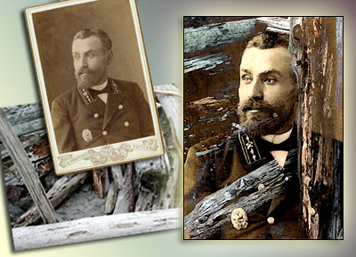 Using an old photo in Photoshop can be challenging. Luckily there’s plenty you can do to revive them. Jeanne sent me a scan of this Russian officer which I really liked, so I decided to combine it with another one of her images—a photo of some logs she’d taken earlier this year at Artfest—and combine both into an ATC.
1. First, I cropped the Russian officer to 2.5” x 3.5” and used Adjustment>Levels, Adjustment>Contrast and Adjustment>Saturation to give him more definition.
2. Then I opened the photo of Jeanne’s logs and applied Levels, Contrast and Saturation again.
3. Using the Move tool, I transferred the Russian Officer over to this document and chose Lighten from the layers palette so the logs would show through him.
4. I shifted Jeanne’s guy around until the logs provided a textured frame, and then cropped to 2.5” x 3.5” without merging the images.
5. To make the logs stand out more, I applied Filters>Watercolor.
6. The Russian officer looked a little pixilated to me, so on this layer I used Filters>Palette Knife to soften him up. Note: you will have to play with the filter sliders to get the effect you want.
7. I saved this two-layered ATC, then resaved it merging the layers, and I was done.
The morale of this particular ATC is that if you like an image, don’t give up on it if it doesn’t do what you want it to do straight off. Play with the different options under Image>Adjustments and don’t be afraid to experiment with Filters and Layer effects.
 This is the 100th digital ATC I’ve designed since January 1st and I’ve celebrated by Photoshop-ing this image of Aunt Connie against a scene from Andrea’s cottage.
Does she look like an “Aunt Connie” to you? She doesn’t to me. Nevertheless, that’s her moniker on the back of this photo. (Thanks for the image, Wendy!) In order to get the effect I wanted, I used ten different layers in Photoshop and had a ball.
Last night I looked back at all the digital ATCs I’ve done this year and about ten per cent of them I wouldn’t do again…particularly the one of Emma that kicked this whole project off. Before then, I’d done a slew of others too. I probably have another hundred tucked away in various files, but I don’t think they’re as good. Sometime—when I have the time—I might troll through my Photoshop files and tally them up. But personally, I’d rather be creating new stuff than trying to resurrect my earlier efforts.
Yesterday when Godelieve left a comment on my blog, she wondered how these ATCs would look in a book. I think that’s a great idea Godelieve. Thanks for the suggestion.
 For three days John and I have had no Internet access because of several brownouts on Saturday night. Horrors! Am I the only person who worries they might miss the email that could change the course of their entire life (in a good way)? Pathetic, isn’t it?
Sunday was my niece Claire’s 21st birthday party and for the first half hour I had to control myself from going upstairs to Pam’s office to check out my inbox. Fortunately I soon forgot about connecting to the world at large and focused on enjoying the festivities—mainly by doing a lot of eating and yakking, both of which I excel at.But actually, the longer I went without email, the easier it was to handle it. The funny thing is, we could have fixed everything on Saturday because the problem was a build up of static electricity. Unplugging John’s computer (which I’m networked to) seemed to do the trick. Maybe the static inside our own heads was mirrored by what was going on in digital land? Anyway, the point of this post is: if you’re having computer difficulties, unplug everything and then reconnect. This is the second time it’s worked for us—and for different problems.
 I have several books I want to read, but they’re all non-fiction, and I’d much rather spend all day gorging on a big fat novel with Lily on the couch beside me. But that won’t be happening because I have too much to do. Maybe Monday? It’s a holiday here in Canada.
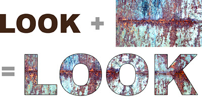 This week I’m going to explain how to turn a photo into type. It’s a fun technique that you can use for scrapbooking pages, a simple card or even as a collage element.
1. Open a new document—5” x 2.”
2. Set the foreground color to black in the Toolbox.
3. Click on the type (T) icon in the Toolbox. Choose a chunky typeface—I used Arial Black here—and a high point size. To go above 72 pt type, you will have to set the number manually in the Options Bar just like you do the typeface. Now position your cursor and enter your word, but don’t rasterize the type.
4. Using the Move Tool, drag the photo you want to use into your new document making sure it becomes the layer above your word. (I used part of a photo I’d taken of rusted metal in my example).
5. Press Control-Alt-G (Mac: Command-Option-G) to create a clipping mask and your photo will instantly turn into type. Use the Move Tool to shift your photo around until the effect pleases you.
6. If you want to outline your word like I did here, double click on the space to the right of your word in the Layers Palette. This brings up the Layer Styles Menu and you click on Stroke. Because a Red outline is Photoshop’s default color, to change it to Black, you will have to double click on the space beside Stroke to bring up yet another menu. Click on the Color rectangle to open the Color Picker and choose Black—or another shade if you like. Sounds complicated, but once you’ve done it a couple of times you’ll get the hang of it.
Note: This effect works with Photoshop versions CS and higher. If you’re using Photoshop 6 or 7, check out Photoshop 911 for the steps you need to take to achieve this effect.
 This is another one of my altered ATCs in the unfinished “Hot Babes” series. Last month I picked up a pile of trading cards for ten cents at a lawn sale. Even though I’ve only managed to find time to alter four of them, it’s a fun project and I’m actually using some of the scrapbook paper, dictionary pages and maps I’ve amassed over the years.
I’ve been wishing I had this babe’s energy because I’ve been under the weather since yesterday. I went to bed before twelve last night, which is something I only do when I absolutely have to.
 Emma got an email to say she’d passed her bar exams today, and we’re so thrilled for her. Now all she has to do now is work like a dog* for the next ten months to finish her articling and then she’ll be a full-fledged lawyer. One of the areas that interests her is Intellectual Property—copyright is part of this specialty—so at some point I’ll be able to speak with more authority on this subject (albeit vicariously).
Sometimes I’m tempted to use this blog as an excuse to complain about things that are troubling me. But something usually comes along to distract me—like Emma’s good news or a slice of Longo’s strawberry cream cheese crumb cake. Okay, I’ll admit I’m proactive about the cake thing. It’s a good job I don’t live near Ronna, or I’d be making a pest of myself sampling all of her sweeties.*I’m not sure where the expression “works like a dog” comes from. Aside from patrolling the backyard for skunks and chasing airplanes and rabbits, Lily’s work consists mainly of finding comfortable spots for extended naps and hassling me for snacks. I swear she must have some hobbit in her because second breakfast is obviously her mantra.
I got the bright idea of changing my header tonight. What a nightmare. I deleted stuff by mistake, added others and generally went nuts choosing from fonts and colors. I would like to be able to change each element separately, but Blogger won't let me. Grrrrr. It's time for bed.

 If you’re a type junkie like me, you welcome any Photoshop effect that enhances it – and as you can see from the Back to School samples shown above, adding a drop shadow gives the type more dimension.


