Saturday, September 29, 2007

Our Club Meeting

Our project theme for last night’s meeting was What to Protect, and we had a little cabinet to alter. As usual everyone did something unique. It never fails to amaze me what my friends come up with. I found each and every piece inspiring.
What to Protect ran the gamut from the environmentally aware to the light-hearted. Marissa covered her cabinet with tin foil and then sheltered her Diet Coke, which I thought was hilarious.
When Carmi handed the cabinets out at our June meeting, my first thought was that I wanted to protect my vision—whatever that is—so I went with it. Because I hadn’t done any hands-on artwork over the summer (aside from my journal), I found this project very satisfying.
At the meeting, Carmi taught us to stamp on metal, then to etch and patina it. Our assignment for next time is to incorporate our finished piece into something else, and I’m keen to do this because I already have an idea. John told me this morning that he thinks it’s too labor-intensive. So what else is new? I live to complicate my life creatively—and in every other way too.
P.S. You can check out all our WTP club projects tomorrow on Carmi’s blog.

Friday, September 28, 2007

Photoshop Friday #12

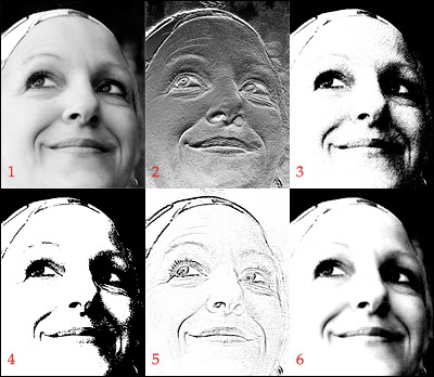
A couple of weeks ago, I explained how to turn a color photo into a black and white graphic using the Threshold command. But there are several other ways you can get dramatic effects by working with the sketch filters in Photoshop.
(1) A high contrast image seems to work best, so I chose a black and white photo from istock for my sample. If you’re starting with something in color, though, go to Image>Adjustments and choose Desaturate.
(2) Most people ignore this carved in stone look, but why not give it a whirl? Select Filter>Sketch>Bas Relief and play with the sliders. (For mine, I chose Detail 13, Smoothness 3 and Light: Bottom).
(3) Terry turned me on to this pen and ink effect and I love it. Go to Filter>Sketch>Graphic Pen and experiment. (My settings were: Stroke Length 15, Light/Dark Balance 50 and Stroke Direction: right diagonal).
(4) If you’re a stamper, you just have to play with this effect and pretend you’re designing your own stamp. Select Filter>Sketch>Stamp and then go to town. (Here I used Light/Dark Balance 25—usually the best for this technique, and a Smoothness of 25).
(5) This is one way to turn an image into a line drawing in Photoshop, although it’s not always reliable. Chose Filter>Sketch>Photocopy and play around with the sliders. (I used Detail 9 and Darkness 8 for mine).
(6) The Conte Crayon filter (in the flyout Filter>Sketch menu) delivers a soft, dreamy effect when you take the time to experiment with the settings. Here I chose Foreground 11, Background 7, Texture: canvas, Scaling 100%, Relief 4 and Light: top—but trust me, it’s not as complicated as it seems).

Have fun with these filters, and I'll see you next week.

Thursday, September 27, 2007

Process or Product?

When it comes to creative work, I’ve always thought I was more geared to results than process. But now I’m not so sure.
Last night as I was finishing off my project for our club meeting tomorrow, I realized that it’s the act of puttering with the bits and pieces that brings me pleasure, not the final product. Once something’s done: that’s it. I’m not one to hang around admiring what I’ve done because I’m already thinking about what to do next.
And for some reason, I’ve never been concerned by whether or not people like what I do visually because I do it to satisfy myself. As Katherine Hepburn once said:
If you always do
what interests you, at least one person is pleased.

Tuesday, September 25, 2007

Stamping with Lumieres

Bev Speare showed us a neat technique on Saturday, which I’d like to do more with. She worked generous amounts of three Lumiere paint colors into a Cut and Dry pad, chose an image—flowers seem to work well—and stamped it on black cardstock. You need to dampen the pad slightly first, and wash your stamp off immediately after using it.
I tried this technique with one of my favorite stamps—Night Tree by Paperbag Studios—then scanned it and turned the image into an ATC. While I’ve experimented with stamps and paint in the past, this method seems to work best.

Sunday, September 23, 2007

The Red Hat Stampers

I am completely exhausted but exhilarated after spending three days up north at Limberlost with my stamping buddies: Debbie, Bev, Margaret, Carin, Lynne, Yvonne and Beverly. It was our third annual Red Hat Stampers Weekend and we had a fantastic time laughing, stamping and eating.
We made cards, a purse, a gift pouch, an ATC box—and also stamped with Lumieres and created on canvas. I feel a little guilty that I didn’t go on the group hike yesterday afternoon. It seemed crazy to be indoors on such a beautiful day and in natural surroundings, but Carin and I were trying to figure out the ArtLenz System of stamping so we stayed behind. (And thoroughly enjoyed ourselves, I might add).
I couldn’t sleep last night, and about four in the morning I went outside to look at the stars. They were amazing—I swear I saw a galaxy—and I was tempted to wake everyone else up to take a look. Somehow experiences like that remind you there’s much more to life than the day-to-day grind.

Friday, September 21, 2007

Photoshop Friday #11

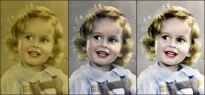
When David was in Junior Kindergarten, one of the parents pointed him out to me and said: “That poor child is in desperate need of a haircut.” “I’ll be sure to let his mother know,” I replied. David was adamant however: no one was cutting his hair.
As you can see from this cute picture of John as a toddler, the Samson thing seems to be something of a tradition in our family. But the hand-tinted photo has yellowed over the years, and I wondered what Photoshop could do to restore it.
(1) First, I scanned the photo and then saved it. I reopened it in Photoshop and gave it a new file name so I could use the original again.
(2) Then I right-clicked on the Background in the Layers Palette and chose Duplicate Layer.
(3) Working on this layer (Background Copy), I used Image>Adjustments>Auto Contrast, and then Image>Adjustments>Auto Color to get it closer to the original look of the black and white photo.
(4) John looked too gray to me though, so I right-clicked on the Background Copy and chose Duplicate layer again. Now I had three layers.
(5) Working on Background Copy 2, I clicked on Linear Dodge in the drop-down Layers Palette menu and lowered the opacity to 40 per cent.
(6) John definitely looked brighter now, but a little washed out, so I merged the layers (Layer>Flatten Image), then chose Image>Adjustments>Brightness and Contrast, increasing the contrast by 17 per cent.
(7) And finally I played with Image>Adjustments>Curves to darken John slightly.
When you’re working on your own old photo, you will have to experiment with these effects to get something you’re happy with. Begin with Auto Contrast and Auto Color, and see what happens. You might discover that this is all you have to do to restore it.

Thursday, September 20, 2007

In the Mood to Read

I don’t read as much as I used to and this bothers me. Most of the reading I do now is for information, not entertainment, but I feel the urge to devour multiple novels coming on.
Today I bought Vanity Fair to read while I’m away for the weekend, and Roberta sent me a couple of really interesting books to review for RubberStampMadness. I’ve never reviewed craft books before, so I’m looking forward to this. Hopefully I won’t have to say anything negative. It’s never bothered me before, but somehow I’d feel disloyal if I have to criticize a fellow artist…particularly one who has written a book because I know how difficult that is.

Wednesday, September 19, 2007

Going Through My Stuff

I like this image of "Ella" that I put together with elements from Christina’s digital scrapbooking line because I’m sure Ella’s household ran smoothly, and all her stuff was beautifully organized.
Since I’m gearing up for the Red Hat Stampers weekend—and getting ready to do my assemblage project for our club meeting on the 28th—I’ve been plowing through box after box of supplies looking for inspiration. Actually I don’t think I’m in need of inspiration because ideas come easily to me. No, the problem is making decisions…always the clincher for me.
Anyway, I found some interesting stuff I’d forgotten about like the inside of a camera, leopard print reading glasses, a bowl of my grandmother’s I broke that forty years ago, an old roof shingle, a Styrofoam heart and some watch parts (among other things). I feel like staying up all night and planning more assemblages. Down girl. You already have way too much to do.

Tuesday, September 18, 2007

Claire Light

I have four wonderful nieces—all different, all beautiful. But while the word “niece” describes their relationship to me, it doesn’t express who they really are.
I was thinking about individuality as I experimented with this photo of niece #2, Claire Light. Claire is one of those women who was born to be cool. She reminds me of the French girls I used to take on tours when I worked at Casa Loma. It didn’t matter what they wore, they always looked poised, hip and put-together. And that describes Claire exactly.

How does she do it, I wonder? I guess a sense of style just comes naturally to her.

Monday, September 17, 2007

Terry Garrett

My fellow black and white fanatic, artist Terry Garrett, recently sent me four fab creations which combine some of Catherine Moore’s stamps with his own images done in Photoshop.
I particularly like this one because the caption reads: “Agnes worried that her writer’s block had returned.” Since I’ve been struggling with that problem myself lately, I could really relate to it. (Although I do have to say, Terry makes writer’s block look a lot more interesting than it's actually proving to be).
By the way, if you have any back issues of RubberStampMadness, check out the article on him in the May/June 2004 issue. I love how Terry

takes the art of stamping to a whole new level.

Saturday, September 15, 2007

Happy Birthday Keith!

It’s hard to believe it, but Keith has reached the half-century mark. He’s a loving husband, father, son, friend, boss, soccer coach and all around great baby brother—witty, wry, loyal, plain-spoken and fun.
Because I’m the oldest, I remember all sorts of things about Keith, like my father phoning at six in the morning on Sunday September 15th, 1957 to say that the three of us—myself, Robin and Pam—now had a new brother. When I think about Keith, I often remember the time I was looking after him when my parents were away on holiday. He was in grade six and I was in university, and I skipped Italian to go to his elementary school for his tumbling meet. Keith was so excited to see me that he couldn’t stop grinning and kept losing his focus. That’s just one memory of him that I’ll always treasure. So here’s to another half-century Keith…

Friday, September 14, 2007

Photoshop Friday #10

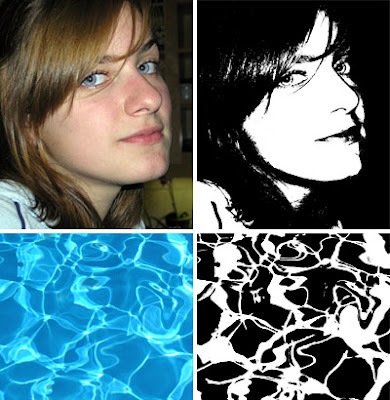
Transforming a color photo into a black and white graphic using Photoshop is quick and easy. It works well for both textured backgrounds and portraits. But to get a good result, your image must have plenty of contrast like this photo I took of my niece Casey, or the one of water in a swimming pool.
Here’s how to do it:
(1) Open your document, and right click on your background layer in the Layers Palette. Choose Duplicate Layer. (This is the layer you will be working with, so you can leave your original intact).
(2) Go to Image>Adjustments and choose Threshold. In the Threshold dialogue box the slider is set at a default position of 128, which is what I used on both Casey and the water. But you may have to play with it to get the effect you want with your own photo. Now click OK and you’re done.
(3) Yes, you really are done. (I told you it was easy!) Doesn’t this technique make you want to design your own line of rubber stamps?

Thursday, September 13, 2007

A New Motherboard

My computer flat-lined on Tuesday, and thankfully I only lost the two pages of my book that I happened to be working on. (Even though it was a drag, at least I had done a complete back up the day before).
We tried all sorts of recovery methods, but nothing worked, so it was off to 123 Computers for some digital first aid. John picked up my reformatted computer around suppertime tonight—complete with a new motherboard.
He asked the technician if he could take the old one home to me because “Susan likes to take things apart and put them back together again.” The guy gave John a blank look, but gave the motherboard to him anyway.
As soon as John got home, I started taking pictures—it looks just like a miniature city! However, I soon discovered that I’ll have to find my camera software so I can download the photos to Photoshop. The closest I can come to a picture of the old motherboard at the moment is my daughterboard. And I have no idea what this ATC of Emma will look like either because I have to calibrate my monitor too.
I’m not looking forward to reloading all my fonts, brushes and gradients, not to mention my “preferences.” I spent a lot of time setting up Photoshop to suit me. Now I can’t remember how I actually did it. This time I'm going to make notes.

Tuesday, September 11, 2007

What Year Are You?

You Belong in 1962

You are a free spirit with a huge heart. Love, peace, and happiness rule - oh, and drugs too.


June posted this link to her blog on Sunday, so I just had to try the quiz. I was hoping I'd get a cool year...1970 maybe? But no, I clocked in at 1962, which is okay when I think about it because at least I was alive then.
I don't remember doing any drugs though. I spent most of my time listening to the Beatles on my transistor radio. No headphones then, but I did have one of those thingames that looked like a hearing aid so I could listen to the radio while I was at school. I remember the cord detaching one day and Da Do Ron Ron suddenly blaring out and scaring my Math teacher. She took me to the washroom for "a little talk," and then cried. Apparently she hated teaching and I was driving her crazy. Needless to say, it was the only year I ever got a decent math mark because I felt sorry for her. The moral of this story is that guilt does work (occasionally).

Monday, September 10, 2007

Catching Up

ATC Quarterly guru Ronna Mogelon and her charming boyfriend Richard were in Toronto for a birthday party this weekend, and I met them beforehand for lunch. Even though we’d never met face to face before, I had the weirdest feeling of déjà vu—like we’d known each other forever and were just catching up. It was so much fun—and gave me a much-needed break from dealing with all the computer problems I've been faced with recently.
Remember that poor bloated PC-er on the Mac commercial? Well, I feel his pain. Not all of it though—at least I don’t have to wear a suit, and I’ve never been patronized by a hip, young Metrosexual (at least that I know of).
Life was much simpler when I wasn’t using a computer. On the other hand, there’s an answer for everything on the Internet. I leaned on my keyboard—why I don’t know—and I lost all my file names. But all I had to do to fix this was to enter the problem in Goggle, and an answer came up. I just love that. And the Internet is how I’ve met great people like Ronna and keep up with everyone else close to my heart.

Friday, September 07, 2007

Photoshop Friday #9

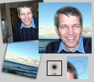
I really like this photo I took of my brother-in-law Brian, but the background was too dark so I decided to move him to a new environment.
Here’s how I did it:
(1) I opened the file I wanted to use as a background—the sky up at Meaford—and resaved it under a new name.
(2) Then I opened the photo of Brian, and using the Move tool (press “v” on your keyboard to activate it), I moved Brian over to the sky background.
(3) My next step was to choose the Eraser tool (press “e” on your keyboard to activate).
(4) Then I went to the Options bar and chose the Brush from the Eraser drop down menu, and a soft brush setting of 100 px—see above to get an idea of what it looks like. Note: Depending on the resolution you’re working at, you might need to choose a larger or smaller brush).
(5) If you’re following along with me, make sure that you have Full Size Brush Tip and Show Crosshair checked in the Edit>Preferences>Display and Cursors menu before you start using your brush.
(6) Now comes the tricky part. To erase the dark background, right click on your mouse and hold down taking short strokes. Check the picture above and you’ll see where I placed my brush as I was working around Brian. While it isn’t rocket science, it does take a little practice to get it right. I usually isolate the figure first like I did with Brian and then erase the rest of the background.
(7) When I finished, I used the move tool to place Brian where I wanted him on the background and then cropped.
To be honest, this technique usually works better on a darker background, but it was easier for me to show you how to do this on a lighter one. And when it comes to choosing an image of a person to work with, avoid someone with too much edge detail like flyaway hair or fingers.

Thursday, September 06, 2007

John's Great Granddad

I’ve been scanning and restoring old family photos for John to send to his second cousin in Scotland. This one of John’s great grandfather was taken when he was best man at his sister’s wedding. Love the top hat, don’t you?
The interesting thing is that when you scan a photo that’s over 100 years old, you can see what the passage of time does to the emulsion. Even though he was only about twenty in this photograph, Great Granddad’s face was all wrinkled up like a prune completely obliterating his nose. So I gave him a new one and also removed the pencil thin eyebrows that the photographer had added with a tiny brush.

Photo restoration is a painstaking business, but I really enjoy it because it’s so satisfying. When I finished, I decided to update Great Granddad to the 21st century by ATC-ing him with some layer effects and collage elements in Photoshop.

Wednesday, September 05, 2007

Carin in RubberStampMadness

Concentration is a problem for many of us when it comes to our art. We’re attracted to so many different techniques and projects that we often feel spread too thin. Where to start? What to do?
But Carin Brahm never seems to have that problem. Stamping is her starting point and nearly everything she does takes the medium father and pushes the envelope. She makes cards, artist’s books, framed art and much, much more. What Carin has achieved is amazing when you consider that she works full time and teaches too.
When I was interviewing her for the September/October 2007 issue of RubberStampMadness a few months ago, I was struck by Carin’s dedication and focus. It’s unwavering. And to think that 12 years ago she wasn’t doing any art at all!
The thing with Carin is that she found the medium that clicked with her and then responded to the call. What I learned from Carin is that when you find something that really resonates with you, jump right in and give it your all!

Tuesday, September 04, 2007

A Small Change

A couple of weeks ago my friend Elizabeth Clontz posed the question: What is one teeny tiny thing in your creative workspace that if you shifted or remedied, it would make a big difference in your creative flow?
I have to admit thinking big and complicated is more my style. I’m sure my creative flow would be vastly improved by a $50,000 extension to my workroom—and the services of my niece Bridget (interior designer extraordinaire).
Still, Elizabeth’s question intrigued me so I thought I’d take a shot at answering it. Beside my computer desk, I have a table with dictionaries, my portfolios, clip art, books, journals, paper for my Epson, old photos and so on. Although it sounds chaotic, it’s really quite organized. But every time I want to print something or check my phone book, I have to move a set of upright files out of the way, and I haven’t used any of them in months.
Why hadn’t I done something about this before? Well, it seemed to be such an insignificant problem, and besides—I had nowhere to put the files (or so I thought). But in the space of ten minutes, I’d moved the files to a new location and now had more room and a more efficient workspace. Funny what one small change will do…how about you?

Monday, September 03, 2007

A Non Labour Day

David and his girlfriend came over yesterday for a visit and we had a great time. While Leigh and I hung around and got to know each other better – she’s studying art history at UCLA and is just lovely – David cooked a special dinner for us (although John informed me that he stirred the pasta a couple of times).
One of the advantages to having people over is that you have to put some effort into cleaning and tidying beforehand – that is if you don’t want your guests to think you’re a slob. Even though I know I’m housekeeping-challenged, I like to maintain the illusion that I’m not. So it was nice to wake up to a spic and span house this morning – one that I didn’t have to feel guilty about for a change.

Because I was feeling pleased with myself, I decided to do nothing today except figure out how to make my own brushes in Photoshop and watch TV. I’ve always been confused about Labour Day though. Are you supposed to take the day off, or are you supposed to work? I have a feeling that I should play hooky more often, but there’s a part of me that keeps saying: What if you like it so much you never want to work again?

Saturday, September 01, 2007

That Time of Year

I know I’m not the only person who gets that itchy feeling inside when September 1st rolls around. You want to buy yourself a fresh box of colored pencils and some pristine notebooks because it feels like the time for a brand new start.
But I never liked school much. I hated being warehoused, and always seemed to be in some kind of trouble for something – passing notes; talking, laughing and carrying on with my friends; skipping school; and just generally wondering why my own personal agenda never dovetailed with what authority figures had in store for me. Oh, and I was never teacher’s pet either.
The weird thing is that I still feel like a student – a student in The School of Life. The question is: will I ever graduate? (And how will I know if I have?)