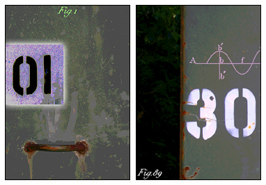
 Sometimes no matter how hard you try, you just can’t work any Photoshop magic on certain images. I labored over these two ATCs, and finally had to give up because I was fed up. I’m not at my best when it comes to using subtle colors. It’s really a stretch for me, and this time there didn’t seem to be much give in the creative elastic.
Just looking at the calendar, I realize I have six more to do, and then that’s January done and dusted. Right now I don’t feel that inspired to continue on, but I think I can manage to stick it out for another few days and complete my challenge.

2 comments:
for some reason when I first saw these, this Jasper Johns work popped in my head. in person, it is much grayer. I disagree with your analysis of these 2. Love the rusted metal highlights.
See more Johns at
http://www.staedelmuseum.de/index.php?id=175
http://www.artchive.com/artchive/J/johns/alphabet.jpg.html
http://www.artnet.com/magazine/news/ntm4/ntm2-1-04.asp
http://media.www.thelantern.com/media/storage/paper333/news/2002/11/07/Arts/Art-That.Goes.Pop-317677.shtml?sourcedomain=www.thelantern.com&MIIHost=media.collegepublisher.com
Susan, I think these ATCs are wonderful. To my minimalist eye, they are just right.
Post a Comment