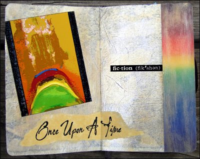
 These two pages annoyed me no end because I just couldn’t get them right. To begin, with I had the bright idea – or so I thought – of using the shadow layer of a napkin as the background. Once I had it glued down it really looked raunchy and needed first aid in the form of Luna Lights and other acrylic paints. While I was doing this, I wrecked the right side. Who knew a napkin could bubble when the glue was already dry?
I could go on, but now I’m even boring myself, so I’ll skip right to the part about how difficult the layout was to do. I tried all sorts of different things, and finally decided I just had to finish it. This was a triumph of sorts because I just let it be.
To my way of thinking, composition is paramount. The individual pieces have to look right in themselves and then harmonize with each other in terms of size, color and texture. I admire people who can spontaneously fire things at a page and then come up with something great.
I’ve always been good at looking at other people’s work and pinpointing what could be done to make it better. But I feel like a novice when it comes to putting something together myself. Thinking about this reminds me of the painting classes I took with Canadian icon Joyce Weiland back in the 80s.
Joyce liked my observations about art so every week she would drag me around with her to comment on everyone’s work. But she never said a thing about mine. I finally grabbed the bull by the horns (she liked bulls) and said: “Now Joyce, what do you think of my work?” She just smiled at me and replied: “Darling, I think you’d make a wonderful art critic.”

No comments:
Post a Comment